

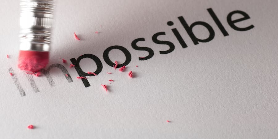
What color is it?
FEATURE — This team at a Scottish university has developed a visual control for bodily fluids that is solving a messy problem in healthcare.
Words: Stephen Yorkstone and Hazel McPhillips
There is a simple and necessary question in healthcare, but one that can cause confusion, embarrassment, and wasted time. “What color is it?”
Here at Edinburgh Napier University’s School of Health and Social Care we are launching a new, free-to-use, digital tool designed to do one thing well: provide a common, clinically relevant, visual standard for communicating the color of bodily fluids.
In lean terms, it is a poka-yoke using visual management for patient communication. It aims to take a process that is subjective, variable, and prone to misinterpretation (asking a patient to recall and describe the color of something) and apply a clear standard to it.
And yes, we are talking about urine, faeces, and sputum!
PROBLEM: USING WORDS FOR COLORS
As lean practitioners, we know that ambiguity can be an enemy of quality. Yet, in clinical practice, we often have to rely on fuzzy words to describe things that words are ill-equipped to handle.
For example, when a patient describes something as “a sort of dark yellow,” and a clinician imagines “probably amber,” yet in the documentation writes “concentrated,” we have broken the chain of accurate communication. In the paediatric care of children, or when supporting patients with neurological conditions or language barriers, the communication gap widens further.
There is also a human nature problem: “poo talk” is embarrassing. We struggle to find the right words because we, understandably, want the conversation to be over. This leads to vague descriptions, leading to poorer data, which could in turn lead to less optimal clinical decisions.
To help with this we realized we didn't need more words, but a standard visual control.
IDEA: A VISUAL CONTROL FOR COMMUNICATION
The What Colour Is It? tool is a straightforward, accessible website. With minimum text, it presents validated colour palettes for urine, faeces, and sputum.
Instead of asking a patient to describe a color, a clinician can simply show them the palette on a phone or tablet and invite them to indicate the colour that best matches their recollection.
This shifts the question from a subjective descriptive “open” question to an objective identification “closed” question. It is the difference between asking someone to describe a specific shade of blue and showing them a color swatch. Even if the color swatch isn’t quite perfect, it’s an entry point into a more helpful conversation about why it isn’t.
Communication will of course never be perfect; there will still be areas of confusion and some situations where the tool won’t quite get it, but our early research demonstrates that it will significantly help.
DEVELOPMENT: CLINICAL, TECHNICAL AND LEAN EXPERTISE
Our development process was collaborative, with our team representing a fusion of clinical and non-clinical disciplines. One of us, our clinical lead Hazel, is a highly experienced Advanced Nurse Practitioner and Lecturer (soon to be PhD) and a synesthete—color is her second language. Another one of us, Stephen, brings in the lean perspective, the improvement architecture, and the initial concept. Manish Khatri, our web developer, ensures the tool is accessible and fast.
In our development conversations, we needed a way to technically identify the colors we were discussing and later realized that insight could become part of tool to be used in practice. To ensure data is robust enough for clinical records, every shade in our palette is tied to a specific HEX code.
For the uninitiated, a HEX code is a six-digit alphanumeric code used to define colors on screens. By using these codes, we can document the description of symptoms with more precision. "Straw Yellow" becomes #F8F6E1. It is searchable, consistent, and universal. It turns a subjective observation into a hard data point. If you type #F8F6E1, you’ll see the color pop up (and yes, IYKYK, hydration is important).
To create the color palettes, we conducted a systematic development process. We reviewed existing posters, leaflets, and clinical charts, collated the data, removed duplicates, and grouped them by hue. We then rationalized similar shades to avoid visual overload without compromising clinical description, validated by expert colleagues.
We discovered that there are indeed many color charts out there, but they are primarily diagnostic resources for individual clinical presentations or types of patients. We were genuinely surprised not to find accessible general tools for clinical color communication— which is what we’re intending “What Colour Is It?” to be.
We took these prototype palettes to an expert group of 13 senior nurses across paediatric, acute, medicine, surgical, and neonatal care. Their feedback was unanimous: 100% found it beneficial, with the majority stating they would use it daily.
“I think it's an excellent concept. It's always very difficult to ascertain in practice true descriptors and tends to be so subjective. Having a universal colour system would help with diagnosis,” one of them said.
“Very useful when colour can be so subjective. Means everyone is working off the same reference and makes things easier for parents rather than describing. Older children often get embarrassed around things like this so would be ideal for them too,” another one commented.
“I really like the idea and have had many incidences where a tool like this would be particularly useful for accurate identification of colors to support patient assessment,” another nurse said.
The people we engaged with told us what they needed for this to work in practice: it had to be free, it had to work offline (hospital Wi-Fi being often patchy), and it had to be mobile-friendly.
So, that is what we built!
REFLECTIONS: LEAN THINKING IN PRACTICE
This project is a practical example of lean problem solving. Often, we try to solve communication problems with additional training or longer forms. We looked at the process and realized that, as so often is the case, the simplest solution is the best.
By applying a visual control, we achieve several things simultaneously:
- Standardization: Everyone is working off the same reference.
- Efficiency: It speeds up the history-taking process.
- Dignity: It reduces the social friction and embarrassment for the patient.
- Safety: It highlights important symptoms that might otherwise be lost in translation and ensures more accurate records of patient descriptions.
The reception to the launch of our proof-of-concept site earlier this month has been brilliant, with people accessing the tool all around the world.
MOVING FORWARD: SMALL CHANGES, BIG DIFFERENCES
We have always loved how small changes, done well, add up to make a big difference. This tool is not a multi-million-pound business transformation. It is a simple, elegant solution to a messy problem. And if it takes off? It will make much more than a multi-million-pound difference.
It is currently live as a proof-of-concept. We are inviting the global lean healthcare community to test it, break it, and tell us what works. We are collecting analytics on usage and will be refining the palettes based on real-world feedback— you can find our email on the website or use our feedback form on there, too.
We want to move away from some of the "guesswork" of clinical color description and towards a future where color is a more reliable data point. So, the next time you are asking a patient to describe the color of something, and they are at a loss for words, don’t ask them to describe it. Ask them to point to it.
Check out the website, share the tool with your friends and colleagues, and, if you’re a clinician, don’t forget to save it to your favourites now, so you can find it when you need it!
You can access the tool for free here.
THE AUTHORS


Read more


FEATURE – Philips has embarked in an ambitious development program for lean executives, which is helping the organization make substantial progress in their transformation.

INTERVIEW – At the recent Lean Healthcare Transformation Summit in Brussels, Planet Lean editor Roberto Priolo sat down with John Toussaint to discuss the state of lean thinking in healthcare, its challenges and its opportunities.
OPINION – Involvement, active listening and concern are crucial traits of lean leadership and the foundations on which respect for people is built into a learning organization, says Boaz Tamir reflecting on his evolution as a writer.

VIDEO – Meetings are critical to create a culture based on teamwork and to establish a learning organization, but their traditional format tends to encourage individual agendas. Not Lean Coffee…
Read more

FEATURE – Visuals are a natural way in which human beings learn and teach. The author discusses why visual thinking is part of our DNA and the implications this has on our lives at work.

FEATURE – How does visual thinking practically help an organization? The author discusses three different ways in which it can be used to benefit a business and help it to improve itself.

VIDEO GEMBA WALK - Last week PL went to Brazil. We joined a doctor at the gemba in one of the hospitals we visited and asked her to show us their visual management system in the ER.

FEATURE – We often spend a great deal of time and effort trying to fit our organizations into a box instead of building a box that fits our organization, says Sharon Visser.